This article highlights the journey of the BTS logo and the story of this world-famous boy band.
With millions of fans worldwide, BTS has always grabbed attention with each rebranding. Their latest logo, introduced in 2017, was designed by a leading Korean design agency. According to BigHit Entertainment, the process took nearly a year and involved BTS members, the management team, and focus group interviews.
The Beginning of BTS
BTS, a seven-member K-pop group, debuted in the summer of 2013 under BigHit Entertainment. Since then, they have broken numerous streaming records and gradually became a global sensation. Within just six years, BTS released 14 albums, each time impressing fans with their unique style and music. According to Insider Magazine, they are currently the second most-listened-to artists after Billie Eilish.
The 2017 Logo Transformation
During the 2017 rebranding, BTS got a new meaning—“Beyond The Scene.” This change represented their new vision and was dedicated to their loyal fandom, ARMY. The official explanation stated that the purpose of the logo was to “protect youth from prejudice and inspire them to pursue their dreams.”
Before this change, the 2013 logo was in use, which featured a bulletproof vest. It represented their original name Bangtan Sonyeondan (“Bulletproof Boy Scouts”), symbolizing strength and resistance.
Logo Evolution
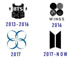
- 2013–2016: The first logo featured a bulletproof vest, lightning sparks, and sharp designs.
- 2016: With the Wings album came a new logo—four circular shapes with “Wings” written below.
- 2017: Another design followed, with four oval shapes and the words “Wings” and “You Never Walk Alone.”
- Current Logo: Two trapezoids (shaped like half-open doors), symbolizing the connection between BTS and ARMY.
Key Logo Elements
- Symbol: The trapezoids represent half-open doors, symbolizing BTS and ARMY coming together.
- Color: A combination of black and silver, reflecting simplicity and elegance.
- Font: A modern sans-serif typeface with slight modifications—rounded edges for “B” and “S” and stylish slashes for “T.”


